
Portals
A portal is the panel shown in the right-hand pane of the M-Files client when a user selects an object. Everything on it is read from that object, which is what separates a portal from a dashboard: a dashboard belongs to no object and shows whatever the vault as a whole can answer.
Portals are configured in M-Files Admin, under the vault’s Applications node. For one built from nothing, see Build a portal in the sample vault.
Which portal opens
Section titled “Which portal opens”A portal opens for the classes listed under Classes, and for nothing else. A portal with an empty class list never opens at all, which is the usual reason a newly added portal does not appear.
When two portals name the same class, the first of them in the configuration wins and the second is unreachable. Nothing reports this as an error, so keep one portal per class.
Open Default decides only whether the portal is brought to the front. Switch it off and the portal tab is still added beside the metadata card; the card stays selected until the user chooses the portal.
How a portal is assembled
Section titled “How a portal is assembled”A portal is a responsive grid, filled in two layers. Grid components arrange, and segment components display.
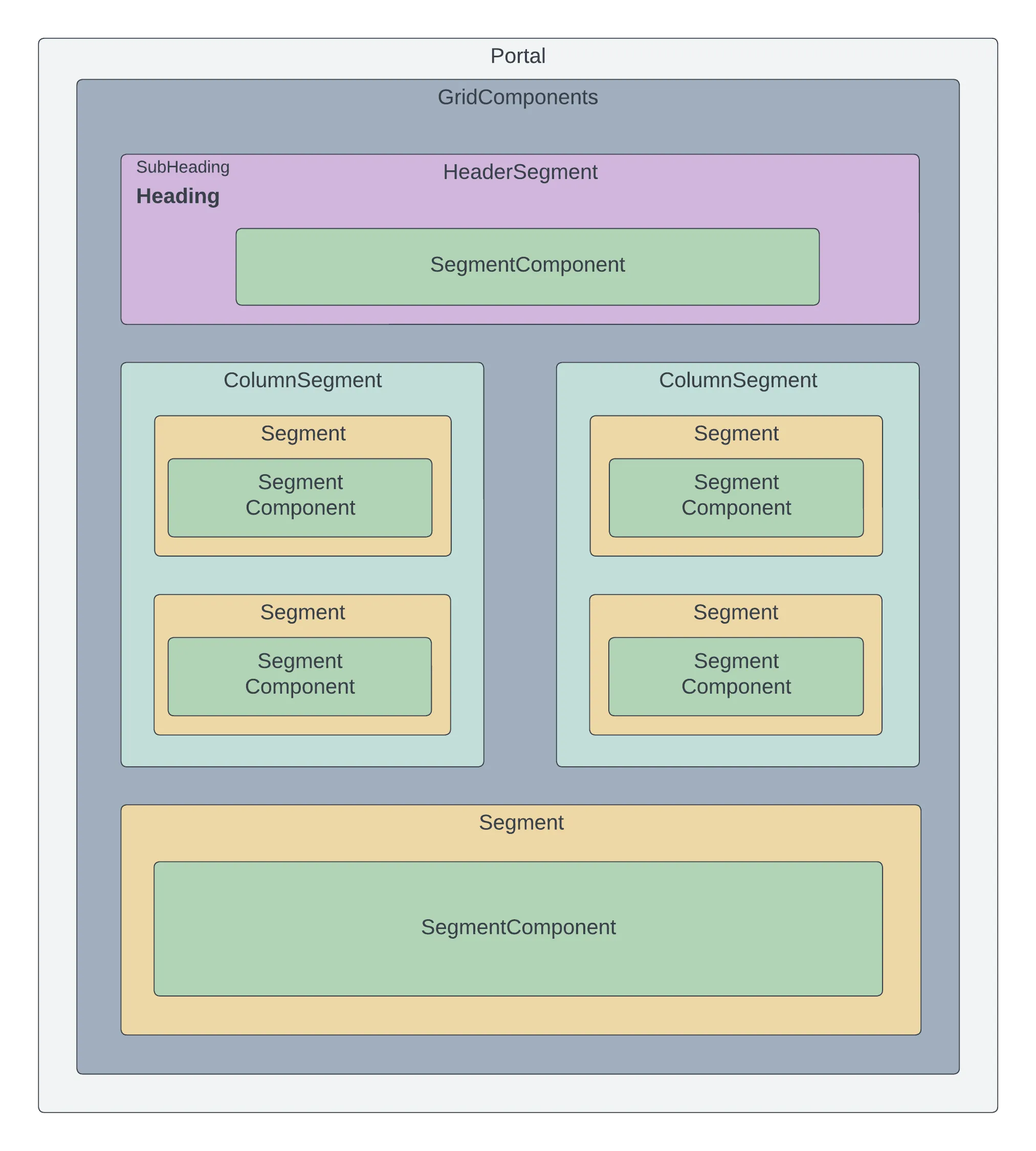
A grid component is one row of the layout, and is one of three kinds: a segment, the plain container; a header segment, whose title strip is filled from properties on the object being viewed; or a column segment, which splits the row into columns that are themselves segments or header segments.
Inside those sit the segment components — forms, menus, list views, plots, calendars, comment feeds, Markdown and raw HTML. Each one is a segment whose Type you set, and choosing the type changes which of its other settings apply. See Components for what each does and the settings it carries.
A segment component never sits directly on a portal. A component that renders nowhere is nearly always one that was added without a grid component above it.
Width and reflow
Section titled “Width and reflow”Every component, segment, column segment and form part has one Width, from 1 to 16: its share of the row when the portal has room. Widths are shares of the grid rather than pixels, because the same portal has to work in a narrow right-hand pane and popped out to full screen.
The portal keeps the layout as configured, and changes it only when a container is too narrow for it. That is judged from the width the container actually has, not from the size of the screen, and what counts as too narrow follows the width you set:
- An element 8 or more wide is treated as a segment, which needs about 400 px. Two 8-wide segments stay side by side down to a container about 800 px wide, then stack.
- An element 4 or less wide is treated as a card, which manages with 180 px. A 4-wide card keeps its quarter of the row down to 720 px, takes half the row down to 360 px, then the whole row.
- An element left alone on its row always takes the whole row.
Before CtrlPortals 3.26.9.37, reflow was controlled with Use Advanced Width, Stackable and Doubling. The upgrade to configuration 2.0 removed all three: an advanced width’s computer value became the Width, and its tablet and mobile values were dropped. A portal that relied on Stackable being off now widens its rows in narrow panes like any other.
Editing from a portal
Section titled “Editing from a portal”With Controls → Enabled on, the portal draws a footer holding the workflow state dropdown and the edit and save controls, and the portal can change metadata and move the object through its workflow. Switch it off and the footer is not drawn: the portal still shows everything, but changes nothing.
The footer is a portal feature only. A dashboard has no object to act on, so it never shows one.
Which parts of a portal appear at all is decided separately, by portal rules.
Settings
Revision
Bumped by the server on every write of this item, and what a later save is merged against (ItemSave): the editor sends it back untouched, so the server knows which revision that editor loaded. Not for hands.
TitleRequired
The title that is displayed either in the dashboard menu or in the tab of a portal.
Tab Name
Use this to override the tab name shown when the portal is opened as a tab in M-Files. Only applies to the legacy M-Files UIs.
Open Default
Determines if the portal should open on top automatically when a matching object is selected. Default: yes.
Theme
Defines the visual theme for this portal. Settings here override the default theme settings.
Classes
Configure which classes will open this portal. Please ensure that multiple portals do not define the same classes.
Rules
Define rules using conditions to show/hide various elements within your portal.
Components
Add and configure the components that will be displayed in this portal.
Portal settings, generated from CtrlPortals 3.26.9.53.